Visualization with Matplotlib to Excel and PowerPoint
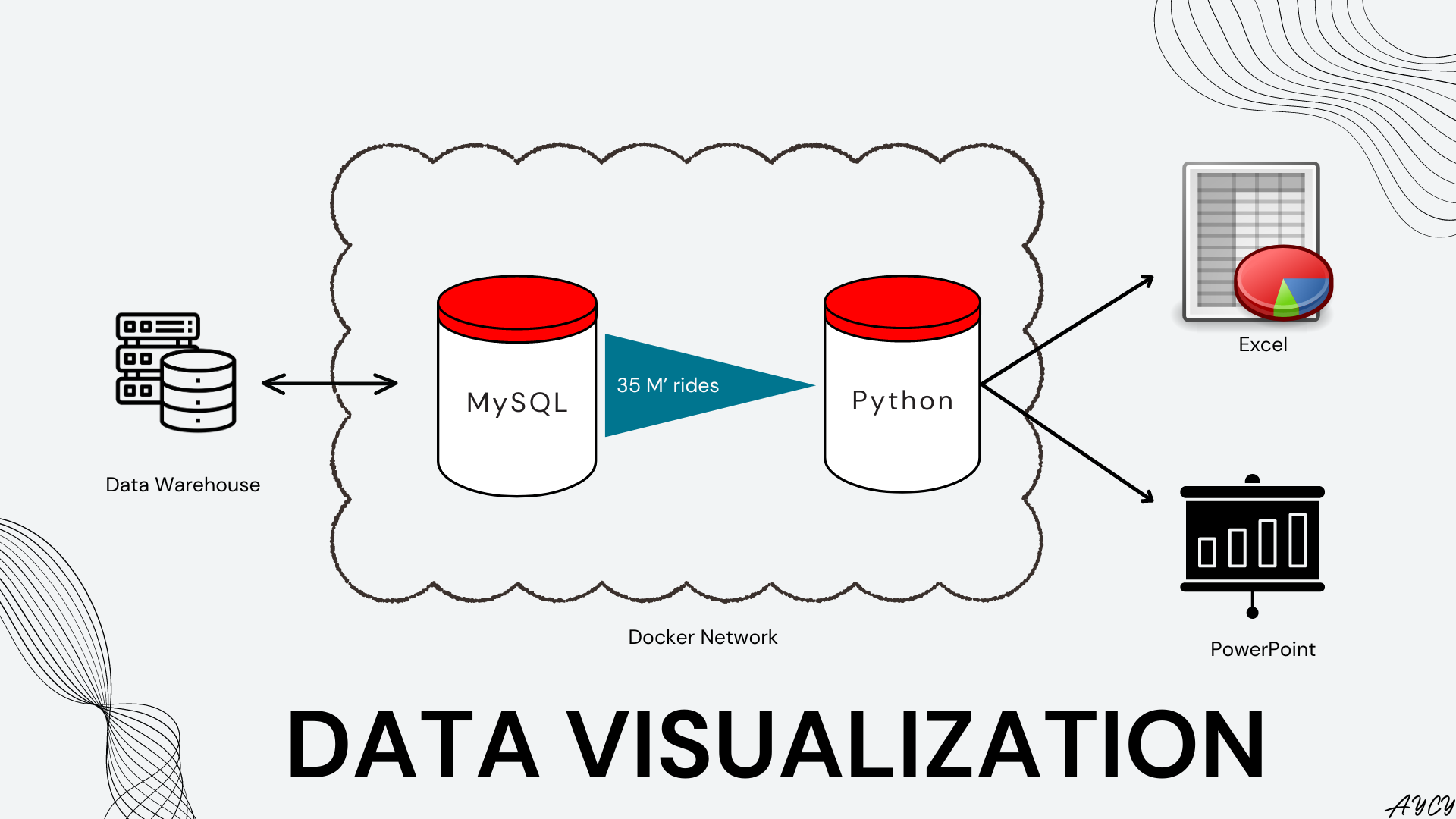
Previously, a data ingestion pipeline was set up to decompress ZIP files and ingest Bixi rides data into a MySQL database. In this article, we explore how SQL was used within Python to summarize “large” data (35 million rows) for highly customizable plotting with Matplotlib. Then, to automate reporting, the plot was exported into both PowerPoint and Excel using Python. The figures and deliverables were designed with the context of presenting the number of annual Bixi rides to management and finance.
Overview of Setup
Docker Environments
The docker containers and Python requirements can be setup by forking the Github repository and running the below line in Terminal in a computer with Docker installed:
# Run below line in terminal within the folder that contains the forked repo
docker-compose -f dev_setup.yaml up
Docker will handle, build, and connect all containers required to replicate this notebook. Instructions on how to access Jupyter will be generated in the Terminal.
Import Packages and Define Functions
To create Microsoft Excel and PowerPoint (PPT) files directly in Python, the openpyxl and python-pptx packages were used.
# For general data processing
import numpy as np
import pandas as pd
import math
import time
from PIL import Image

# Custom functions for measuring time of queries and to print lists
from notebook_functions.timer import timer_wrapper
from notebook_functions.print import print_list

# For static plotting
import matplotlib.pyplot as plt
from matplotlib.patches import Patch
import seaborn as sns

# For the engine that connects Python and MySQL
import sqlalchemy

# For creating PowerPoint files  using python-pptx
from pptx import Presentation
from pptx.util import Inches
from pptx.enum.text import PP_ALIGN

# For creating Excel files using openpyxl
from openpyxl import Workbook
from openpyxl.drawing.image import Image as pyxl_Image # to differentiate from PIL Image
from openpyxl.utils.dataframe import dataframe_to_rows
from openpyxl.utils.cell import get_column_letter
from openpyxl.styles import Border, Font, Side
# Timer wrapper calculates the time used by below function everytime it is run
@timer_wrapper
def pandas_read_sql(engine, sql_stmt):
    """
    =======
    PURPOSE
    =======
    Send a SQL query to a SQL database using a created SQLAlchemy engine, thens receives the output from the SQL DBMS into a pandas DataFrame.

    ======
    INPUTS
    ======
    engine: a SQLAlchemy engine object created using the sqlalchemy.create_engine() method.
    sql_stmt: a string containing the SQL statement to be fed to the SQL DBMS through the engine.

    =======
    OUTPUTS
    =======
    df: a pandas DataFrame containing the output from the SQL DBMS after it has processed the sent SQL query.

    =======
    EXAMPLE
    =======

    sql_stmt = '''SELECT * FROM table'''

    sql_df = pandas_read_sql(engine, sql_stmt)

    >>> sql_df
    """

    assert isinstance(sql_stmt, str), "Passed object is not a string"

    # Open a connection to the SQL DBMS using the engine
    with engine.connect() as conn:

        # Convert string into a SQLAlchemy SQL statement
        stmt = sqlalchemy.text(f"""{sql_stmt}""")

        # Send the SQL statement to the SQL DBMS and receive the output using
        df = pd.read_sql(
            stmt,
            con = conn)

    return df
# convert pixels to inches
def px_to_inches(path):
    """
    =======
    PURPOSE
    =======
    Given a path, opens the image and returns the height and width of the image in inches

    ======
    INPUTS
    ======
    path: filepath to image

    =======
    OUTPUTS
    =======
    width, height: the width and height of the image in inches

    =======
    EXAMPLE
    =======

    filepath =  path
    im_width, im_height = px_to_inches(filepath)

    >>> im_width, im_height
    """

    im = Image.open(path)
    width = im.width / im.info['dpi'][0]
    height = im.height / im.info['dpi'][1]

    return (width, height)
Import Data From MySQL
Create the engine to connect Python to MySQL database.
# Create the connection engine to MySQL database called 'velocipede'
engine = sqlalchemy.create_engine(
    "mysql+mysqldb://root:rootroot@sql:3306/velocipede"
)
As the year 2022 contains data in a different format compared to previous years (membership data is removed), the year 2022 was excluded from analysis for demonstrative purposes. First, a COUNT statement was used to count how many rides were to be analyzed.
# SQL Statement to count the number of rides aggregated by the start date of each ride in UTC timezone.
sql_stmt = """
SELECT
    COUNT(*)
FROM
    rides
WHERE
    YEAR(start_dt_utc) < 2022
"""

df = pandas_read_sql(engine,sql_stmt)
Run 1 of pandas_read_sql took 16.4294 seconds.
Total run time: 16.4294 seconds. Average run time: 16.4294 seconds.
df.head()
| COUNT(*) | |
|---|---|
| 0 | 35027074 |
The simplest of queries took 19 seconds to run. A total of 35 million Bixi rides were to be analyzed. Now, a more complex query was written to summarize the 35 million rides into a smaller table that does not overload the computers memory. For deeper exploration beyond just annual rides, the query was written to summarize Bixi rides by day and membership.
# SQL Statement to count the number of rides aggregated by the start date of each ride in UTC timezone.
sql_stmt = """
SELECT
    DATE_FORMAT(CONVERT_TZ(start_dt_utc,"+00:00","-04:00"), "%Y-%m-%d") AS yyyymmdd,
    is_member,
    COUNT(*) AS rides
FROM
    rides
WHERE
    YEAR(start_dt_utc) < 2022
GROUP BY
    yyyymmdd,
    is_member
"""

df = pandas_read_sql(engine,sql_stmt)
Run 2 of pandas_read_sql took 231.2026 seconds.
Total run time: 247.6319 seconds. Average run time: 123.8160 seconds.
df.shape
(3447, 3)
df.head()
| yyyymmdd | is_member | rides | |
|---|---|---|---|
| 0 | 2014-04-15 | 0 | 48 |
| 1 | 2014-04-15 | 1 | 1529 |
| 2 | 2014-04-16 | 0 | 135 |
| 3 | 2014-04-16 | 1 | 3045 |
| 4 | 2014-04-17 | 0 | 413 |
The results returned from the SQL query had 3,447 rows and 3 columns. This makes sense as To avoid running the SQL query every time, the output was saved as a CSV file for later use. The SQL query took 320 seconds to run, which is quite long for such a simple query due to the size of the data. The query time may be improved using cluster computing methods such as Apache Spark, accessed through , which will be explored in future notebooks.
To avoid rerunning the query, the dataframe was saved as a CSV for future access if needed.
# Save query output to avoid rerunning query
df.to_csv("../12_processed_data/20230825_rides_daily.csv", index = False)
Assumptions
All Bixi rides were included regardless of length of trip. This can be adjusted in the future as trips that are too short might overestimate the number of meaningful rides per year.
Data Visualization - Rides by Year
Plot Data Preparation - Pandas Resampling
The resample method in pandas is powerful for performing aggregations on time-series, for example aggregating daily rides to monthly rides by resampling. To use resample, the DataFrame needs to have a datetime index. For this plot, both member and non-member rides were included.
# Include both member and non-member
plot_df = df.groupby(
    by = ['yyyymmdd'],
    as_index = False).agg(
        rides = ('rides','sum')
)

# Convert yyyymmdd column to datetime
plot_df["yyyymmdd"] = plot_df["yyyymmdd"].astype("datetime64[ns]")

# Use yyyymmdd as index
plot_df.set_index(["yyyymmdd"], inplace = True)

# Examine the dataframe
plot_df.head()
| rides | |
|---|---|
| yyyymmdd | |
| 2014-04-15 | 1577 |
| 2014-04-16 | 3180 |
| 2014-04-17 | 5852 |
| 2014-04-18 | 5325 |
| 2014-04-19 | 6031 |
The index was observed to be changed to yyyymmdd. Now, the resample method can be used to calculate the number of Bixi rides by year. Notice that the index has been summarized to the 1st month and 1st day of every year.
How resample aggregates can be changed by referring to the different Offset aliases.
# Resample from day to year
plot_df = plot_df.resample("1YS").sum()
plot_df.head()
| rides | |
|---|---|
| yyyymmdd | |
| 2014-01-01 | 3136276 |
| 2015-01-01 | 3443883 |
| 2016-01-01 | 4000080 |
| 2017-01-01 | 4740357 |
| 2018-01-01 | 5277541 |
For ease of plotting, a new column was created to extract just the year from each date in the index. Furthermore, as the rides are in the millions, the rides column was divided by 1 million to improve plot readability. Finally, the year and year percentage change in annual ridership were calculated using the pct_change method.
# Divide rides by 1 million for readability
plot_df["rides"] = plot_df['rides']/1_000_000

# Extract year from datetime index
plot_df["year"] = plot_df.index.year

# Calculate year on year change percentage
plot_df["YoY_pct"] = plot_df["rides"].pct_change(1)
# Examine the dataframe
plot_df.head(10)
| rides | year | YoY_pct | |
|---|---|---|---|
| yyyymmdd | |||
| 2014-01-01 | 3.136276 | 2014 | NaN |
| 2015-01-01 | 3.443883 | 2015 | 0.098080 |
| 2016-01-01 | 4.000080 | 2016 | 0.161503 |
| 2017-01-01 | 4.740357 | 2017 | 0.185066 |
| 2018-01-01 | 5.277541 | 2018 | 0.113321 |
| 2019-01-01 | 5.597845 | 2019 | 0.060692 |
| 2020-01-01 | 3.264741 | 2020 | -0.416786 |
| 2021-01-01 | 5.566351 | 2021 | 0.704990 |
The year on year change in ridership (YoY_pct) can be verified through below calculation:
# (2015 rides - 2014 rides) / 2014 rides
print(f"The year on year percentage change for 2015 compared to 2014 was {np.round((3.443883 - 3.136276) / 3.136276 * 100,2)} % increase.")
The year on year percentage change for 2015 compared to 2014 was 9.81 % increase.
The years 2020 and 2021 were observed to have significant YoY_pct changes compared to the other years, most likely due to Covid-19 lockdowns. As these two years are uncommon cases, they will not be included in the plot to avoid skewing the plot.
# Create a new YoY_pct column where 2020 and 2021 are masked with null values
plot_df["YoY_pct_plot"] = np.where(plot_df["year"] <= 2019, plot_df["YoY_pct"], np.NaN)

# Examine the dataframe
plot_df.head(10)
| rides | year | YoY_pct | YoY_pct_plot | |
|---|---|---|---|---|
| yyyymmdd | ||||
| 2014-01-01 | 3.136276 | 2014 | NaN | NaN |
| 2015-01-01 | 3.443883 | 2015 | 0.098080 | 0.098080 |
| 2016-01-01 | 4.000080 | 2016 | 0.161503 | 0.161503 |
| 2017-01-01 | 4.740357 | 2017 | 0.185066 | 0.185066 |
| 2018-01-01 | 5.277541 | 2018 | 0.113321 | 0.113321 |
| 2019-01-01 | 5.597845 | 2019 | 0.060692 | 0.060692 |
| 2020-01-01 | 3.264741 | 2020 | -0.416786 | NaN |
| 2021-01-01 | 5.566351 | 2021 | 0.704990 | NaN |
Simple Bar Plot
To get a gist of the data, the plot method built into Pandas was used to quickly generate a plot of Bixi rides by year.
# Initiate figure object
fig, ax = plt.subplots(
    nrows = 1,
    ncols = 1,
    figsize = (10,5)
)

# Use the convenient matplotlib plot method in pandas
plot_df.plot(
    x = "year",
    y = "rides",
    ax = ax,
    legend = None,
    color = "cornflowerblue",
    kind = "bar"
)

# Remove spines for neatness
sns.despine()

saved_img = f"../22_assets/images/basic_plot.png"
fig.savefig(
    fname = saved_img,
    dpi = 300,
    format = "png",
    bbox_inches = "tight")

# Show plot
plt.show()
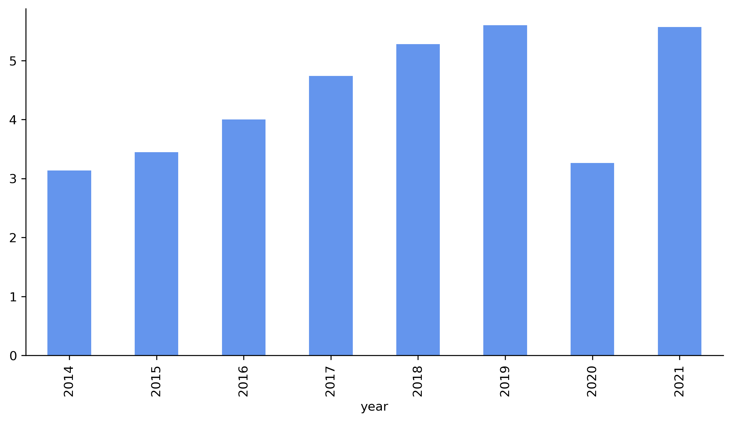
In this simple bar plot, it was observed that the number of rides per year was steadily increasing from 2014 to 2019, until Covid-19 in 2020. Furthermore, ridership recovered to pre-pandemic levels by 2021.
However, the plot is not presentation ready:
- axis and plot titles missing
- xlabels hard to read vertically
- exact ridership not immediately clear to reader (have to guess by drawing lines to axis with eyes)
- Covid-19 situation was not highlighted as anomaly
- year on year change percentage not quantifiably apparent (not clear how much increase)
Customized Figure with Matplotlib and Seaborn
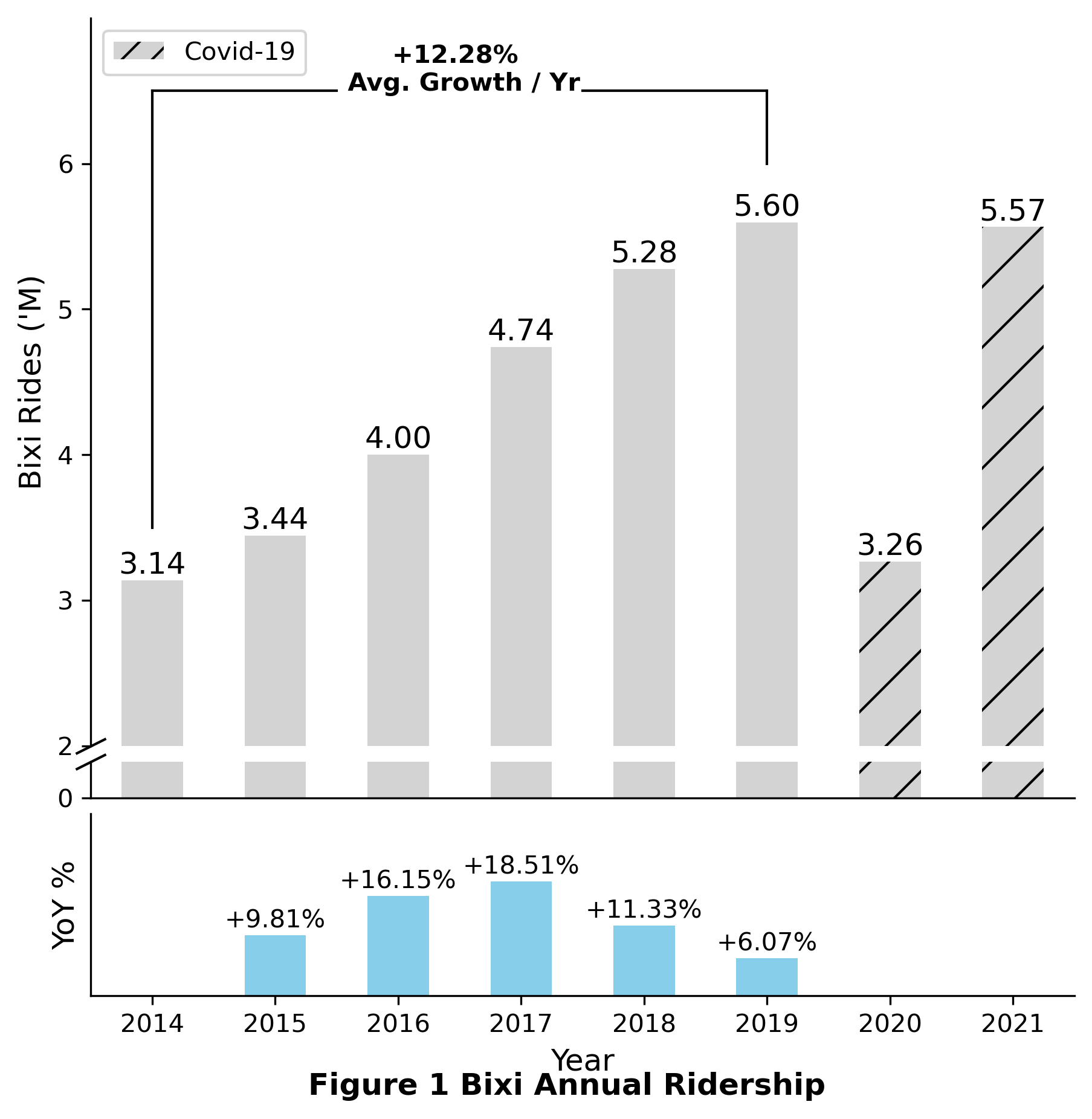
To fix all the above issues, the below large chunk of code was used to generate a very customized barchart, showcasing the power of matplotlib and Python over spreadsheet tools like Excel. The ups and downs of using Matplotlib and Python over traditional spreadsheet tools like Excel are summarized in the table below:
| Python + Matplotlib | Spreadsheets | |
|---|---|---|
| Visualization Customization |
👑 | |
| Data Processing | 👑 | |
| Automation | 👑 | |
| Technical Difficulty |
👑 | |
| Initial Set Up | 👑 |
Finally, rather than explain the all the code in a text blob, comments were included for each section of code to better guide the reader along the process of creating the custom visualization.
def plot_annual_ridership(plot_df):

    # Initiate a figure object with 3 subplots in on top of each other
    fig, ax = plt.subplots(
        nrows = 3,
        ncols = 1,
        figsize = (7,7),
        height_ratios = [20,1,5], # The middle serves to generate a broken axis
        sharex = True # Share the same x-axis to ensure bars are aligned by year
    )

    #################################################################
    # TOP AND MIDDLE SUBPLOTS FOR BAR CHART WITH BROKEN AXIS EFFECT #
    #################################################################

    # Define a list containing Covid-19 years
    covid_years = [2020,2021]

    # Define hatch patterns for each year, https://matplotlib.org/stable/gallery/shapes_and_collections/hatch_style_reference.html
    hatch = ["/" if year in covid_years else "" for year in plot_df["year"]]

    # In the top and middle subplots, plot the same number of rides by year
    plot_df.plot(
        x = "year",
        y = "rides",
        ax = ax[0], # Specify to plot in first subplot here
        color = "lightgrey",
        kind = "bar",
        hatch = hatch,
        legend = None
    )

    plot_df.plot(
        x = "year",
        y = "rides",
        ax = ax[1], # Specify to plot in second subplot here
        color = "lightgrey",
        kind = "bar",
        hatch = hatch,
        legend = None
    )

    # Now the ylimit for each subplot is set accordingly
    # Note: this can be automated but for the sake of simplicity, were hardcoded here
    start = math.floor(plot_df['rides'].min() * 0.9)
    end = math.ceil(plot_df['rides'].max() * 1.1)
    ax[0].set_ylim(start,end)
    ax[1].set_ylim(0,start * 0.01)

    # Set custom yticks to make chart easier to read
    ax[0].set_yticks(np.arange(start,end, step = 1))
    ax[1].set_yticks(np.arange(0,start * 0.01, step = 2))

    # Set up diagonal double lines for broken axis
    d = .5  # proportion of vertical to horizontal extent of the slanted line
    kwargs = dict(marker=[(-1, -d), (1, d)], markersize=12,
                  linestyle="none", color='k', mec='k', mew=1, clip_on=False)
    ax[0].plot([0], [0], transform=ax[0].transAxes, **kwargs)
    ax[1].plot([0], [1], transform=ax[1].transAxes, **kwargs)

    # Define vertical offset for numbers above bars
    vertical_offset = plot_df['rides'].mean() * 0.01

    # Iterate over each xtick to add the formatted annual rides above each bar
    for xtick in ax[0].get_xticks():
        ax[0].text(
            x = xtick,
            y = plot_df["rides"][xtick] + vertical_offset,
            s = "{:.2f}".format(round(plot_df["rides"][xtick],2)),
            horizontalalignment = 'center',
            size = "large",
            color = "black"
        )

    # Set ylabel for visibility
    ax[0].set_ylabel(f"Bixi Rides ('M)", size = 12)

    # Creare a custom legend to highligh Covid 19 years
    legend_elements = [Patch(facecolor = "lightgrey", hatch = "//", label = "Covid-19")]
    ax[0].legend(handles = legend_elements, loc = "upper left")

    #####################################################
    # Bottom subplot for Year on Year percentage change #
    #####################################################

    # Define colors to show positive and negative percent change
    colors = ["skyblue" if x >= 0 else "slateblue" for x in plot_df["YoY_pct_plot"]]

    # Plot the YoY_pct_change
    plot_df.plot(
        x = "year",
        y = "YoY_pct_plot",
        ax = ax[2], # Specify the bottom most subplot here
        kind = "bar",
        legend = None,
        color = colors
    )

    # Define vertical offset for numbers above bars
    vertical_offset = plot_df['YoY_pct_plot'].mean() * 0.1

    # Define numbers to show above bars for positive change and below bars for negative change
    for xtick in ax[2].get_xticks():
        if plot_df["YoY_pct_plot"][xtick] >= 0:
            ax[2].text(
                x = xtick,
                y = plot_df["YoY_pct_plot"][xtick] + vertical_offset,
                s = "{:+.2%}".format(round(plot_df["YoY_pct_plot"][xtick],4)),
                horizontalalignment = 'center',
                size = "medium",
                color = "black"
            )
        else:
            ax[2].text(
                x = xtick,
                y = plot_df["YoY_pct_plot"][xtick] - vertical_offset * 8,
                s = "{:+.2%}".format(round(plot_df["YoY_pct_plot"][xtick],4)),
                horizontalalignment = 'center',
                size = "medium",
                color = "black"
            )

    # Shift the bottom spine to be centered at zero
    ax[2].spines["bottom"].set_position("zero")
    ax[2].set_xlabel(f"Year", size = 12)
    ax[2].set_ylabel(f"YoY %", size = 12)

    # Set ylimit of bottom subplot
    start, end = ax[2].get_ylim()
    ax[2].set_ylim(start,end + 0.1)

    # sns.despine()
    # Remove spines between top and bottom
    ax[0].spines.top.set_visible(False)
    ax[0].spines.bottom.set_visible(False)
    ax[0].spines.right.set_visible(False)

    ax[1].spines.top.set_visible(False)
    ax[1].spines.right.set_visible(False)

    ax[2].spines.top.set_visible(False)
    ax[2].spines.right.set_visible(False)

    ax[0].tick_params(
        top = False,
        bottom = False,
        labelbottom = False)

    ax[1].tick_params(
        top = False,
        bottom = False,
        labelbottom = False)

    ax[2].tick_params(
        left = False,
        top = False,
        labelleft = False)

    # Rotate year labels to be horizontal
    for label in ax[2].get_xticklabels():
        label.set_rotation(0)

    # adjust space between axes
    fig.subplots_adjust(hspace=0.05)

    return fig, ax
Now the above function can be used to generate the plot and and to add annotations.
# Use plot function to generate subplots
fig_1, ax_1 = plot_annual_ridership(plot_df)

# Add a title for all subplots
title = "Figure 1 Bixi Annual Ridership"
fig_1.suptitle(f"{title}", y = 0.05, size = 12, fontweight = "bold")

# Define start and end points for annotation lines and text
# Change this part for each figure
year_start = 2014
year_end = 2019
x_start, x_end = 0, 5
low_x1, low_y1 = x_start, 3.5
low_x2, low_y2 = x_start, 6.5
high_x1, high_y1 = x_end, 6
high_x2, high_y2 = x_end, 6.5
mid_x1 = ((high_x1-low_x1)-2)/2 # Leaving a white space in the middle for text annotation
mid_x2 = high_x1 - mid_x1

# Add vertical lines at x_start and x_end
ax_1[0].plot([low_x1, low_x2],[low_y1,low_y2],'k-', lw=1)
ax_1[0].plot([high_x1, high_x2],[high_y1,high_y2],'k-', lw=1)

# Add horizontal lines from x_start and x_end to the middle
ax_1[0].plot([low_x2,mid_x1],[low_y2,low_y2],"k-",lw=1)
ax_1[0].plot([high_x2,mid_x2],[high_y2,high_y2],"k-",lw=1)

# Calculate average annual change for given years
year_end_value = plot_df[plot_df.index.year == year_end]["rides"].values
year_start_value = plot_df[plot_df.index.year == year_start]["rides"].values
avg_pct_change = math.exp(math.log(year_end_value/year_start_value)/(year_end-year_start))-1

# Add text annotation for average annual change
ax_1[0].annotate(
    f"+{np.round(avg_pct_change*100,2)}% \n Avg. Growth / Yr",
    xy = ((high_x1-low_x1)/2,high_y2),
    zorder = 100, # zorder set to arbitrarily high number to avoid clipping
    size = 10,
    fontweight = "bold",
    ha = "center"
)

saved_img = f"../22_assets/images/{time.strftime('%Y%m%d-%H%M')}_{title}.png"
fig_1.savefig(
    fname = saved_img,
    dpi = 300,
    format = "png",
    bbox_inches = "tight")

# Show plot
plt.show()
Export to Microsoft PowerPoint
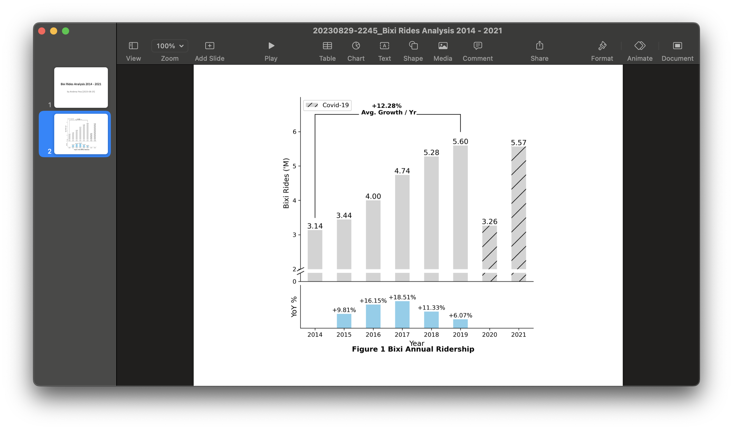
A simple but clear PowerPoint was created using the code block below. Although aged, the python-pptx package can be used to automate the creation of detailed PowerPoints.
# Create presentation object
prs = Presentation()

# Create a title slide
title_slide_layout = prs.slide_layouts[0]
slide = prs.slides.add_slide(title_slide_layout)
title = slide.shapes.title
subtitle = slide.placeholders[1]
title.text = "Bixi Rides Analysis 2014 - 2021"
subtitle.text = "by Andrew Yew [2023-08-29]"

# Create a image slide
blank_slide_layout = prs.slide_layouts[6]
slide = prs.slides.add_slide(blank_slide_layout)
img_path = saved_img
img = px_to_inches(img_path)

# Calculate side spaces to center image in slide
left = Inches(prs.slide_width/914400 - img[0]) / 2
top = Inches(prs.slide_height/914400 - img[1]) / 2

# Add image to slides
pic = slide.shapes.add_picture(img_path, left, top)

# Save presentation
prs.save(f"../22_assets/presentations/{time.strftime('%Y%m%d-%H%M')}_{title.text}.pptx")
The genereated PowerPoint presentation can be found here.
Export to Microsoft Excel
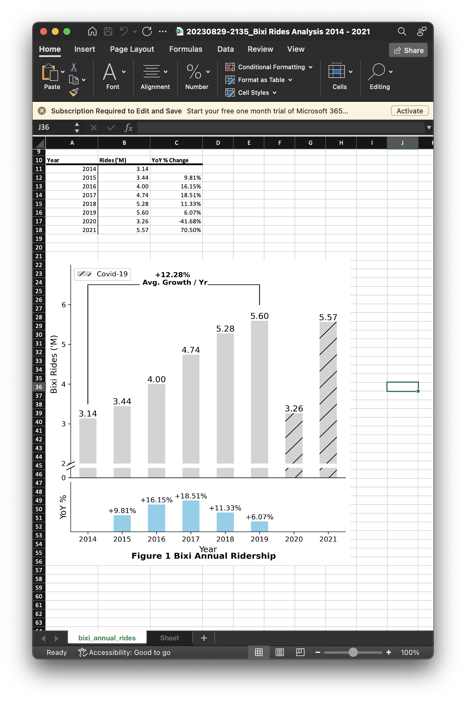
The Excel file is supplementary material for the finance team, who might want to have the numbers in a convenient Excel workbook for them to follow along the PowerPoint. The openpyxl package was used to format the pandas dataframe into a neat presentable table within an Excel workbook.
# Create an Excel workbook
wb = Workbook()

# Create a named worksheet
ws = wb.create_sheet(title = "bixi_annual_rides", index = 0)

# Create a list for column names
plot_df_xlsx = plot_df.rename(
    columns = {
        "year" : "Year",
        "rides" : "Rides ('M)",
        "YoY_pct" : "YoY % Change"
    }
)

columns_to_print = ["Year", "Rides ('M)", "YoY % Change"]

for index, column in enumerate(columns_to_print):
    col_alpha = get_column_letter(index + 1)
    ws.column_dimensions[col_alpha].width = 15
    cell = col_alpha + f"10"
    ws[cell] = column
    ws[cell].font = Font(bold = True)
    line = Side(border_style = "thick")
    ws[cell].border = Border(bottom = line)

    for row_index, value in enumerate(plot_df_xlsx[column].to_list()):
        cell = get_column_letter(index + 1) + f"{row_index + 11}"
        ws[cell] = value

        if index == 0:
            line = Side(border_style = "thin")
            ws[cell].border = Border(right = line)

        if column == "YoY % Change":
            ws[cell].number_format = "0.00%"
        elif column == "Rides ('M)":
            ws[cell].number_format = "0.00"

img = pyxl_Image(saved_img)
img.height = 700
img.width = 700

ws.add_image(img,f"A{11 + plot_df.shape[0]+3}")

wb.save(f"../22_assets/spreadsheets/{time.strftime('%Y%m%d-%H%M')}_{title.text}.xlsx")
The generated Excel file can be found here.
Conclusion
35 million Bixi rides were summarized using SQL before plotting with Matplotlib. Then, the plots were exported into both Microsoft Excel and PowerPoint files for reporting. In the future, the long query time will be reduced using PySpark with the data stored in Parquet file format instead of comma separated values(CSV).
The Github notebook for this article can be found here.
